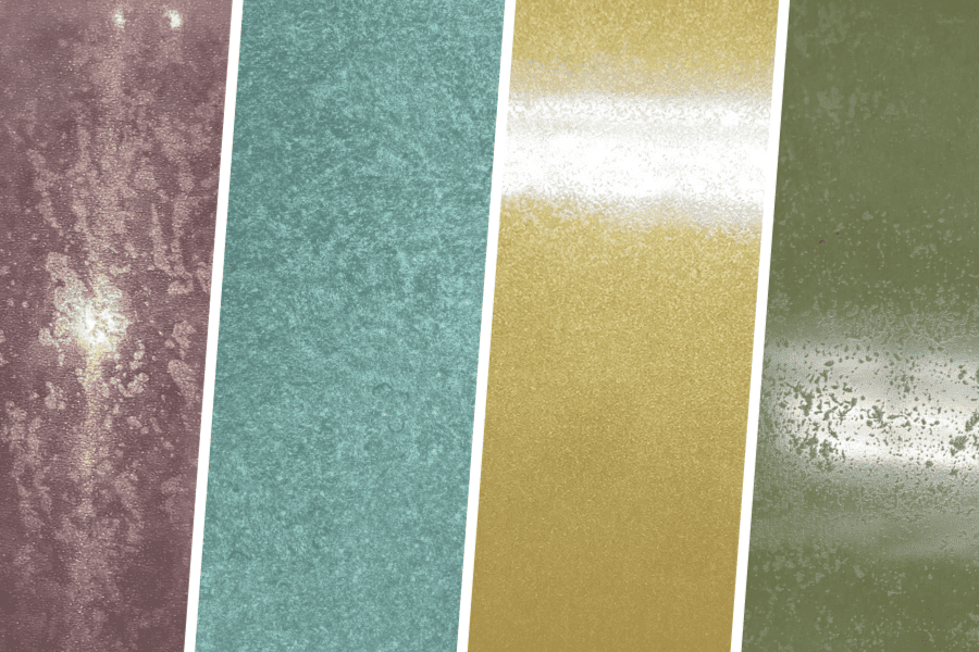
Incorporating color into building design
While we believe all metals are beautiful in their classical forms, Robert Venturi once said, “Blatant simplification means bland architecture.” Metal can be much more than rust, blackened steel, or stainless, stepping outside the normal metal color chart to offer super saturated colors that inspire and evoke emotion. When used correctly, it is the fidelity, depth, and transformative power of color in architecture and interior design that impresses us most.
Over the past year, we have seen increased demand in custom colors that are equally vibrant, one of a kind, and visually stunning. To understand the needs of a custom color design, we ask designers to consider the following elements:
- Is the color warm or cool? This can help determine the undertone.
- Is it monolithic or are there subtle highlights and accents of color? With a multistep coating process, variation of color, tone, and contrast are expected.
- Is the material meant to be more substantial or dynamic? This will make the material either textured and diffuse or reflective and specular.
- Is the application interior or exterior? Lighting and angle of interaction can change the way the surface is interpreted.
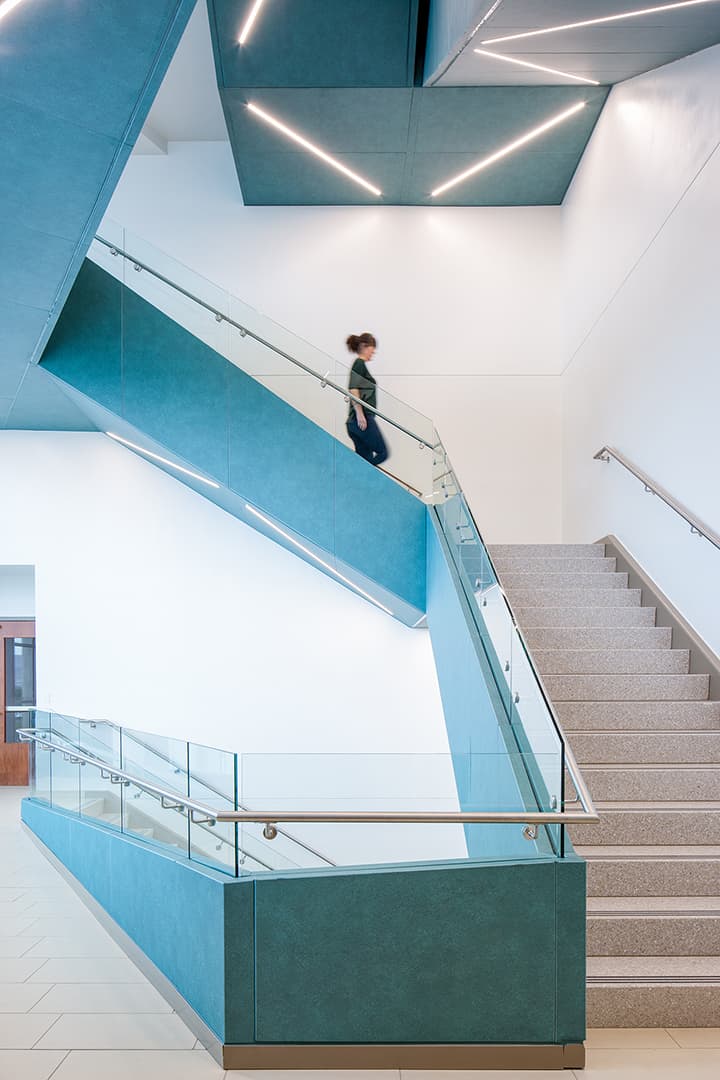
We have a developed a design process, requiring limited work on your end, where we work with you to dial in the right saturation, texture, and/or scale of the pattern to ensure the selected surface is exactly right for your project. Explore some of our results:
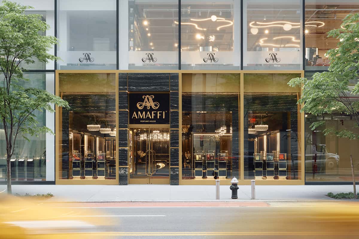
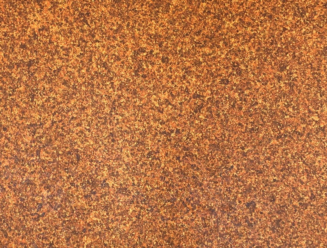

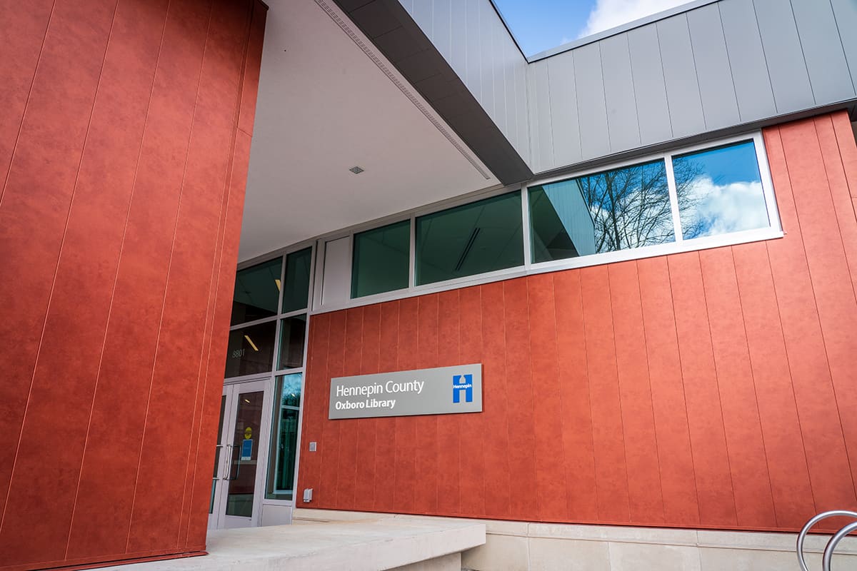
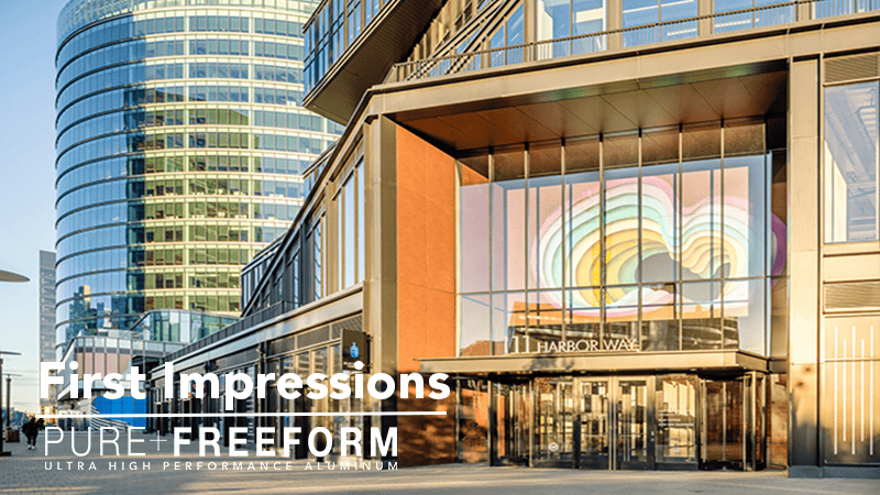
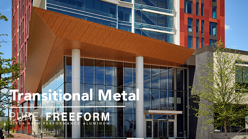
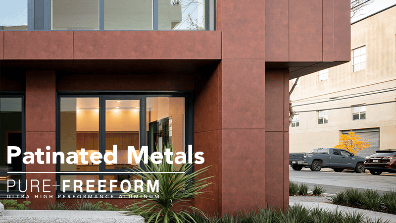
Above: Amaffi NYC uses Relic to clad exterior mullion caps, Caxia, Playa Gold, Oxboro Library uses Prismatic Spritz
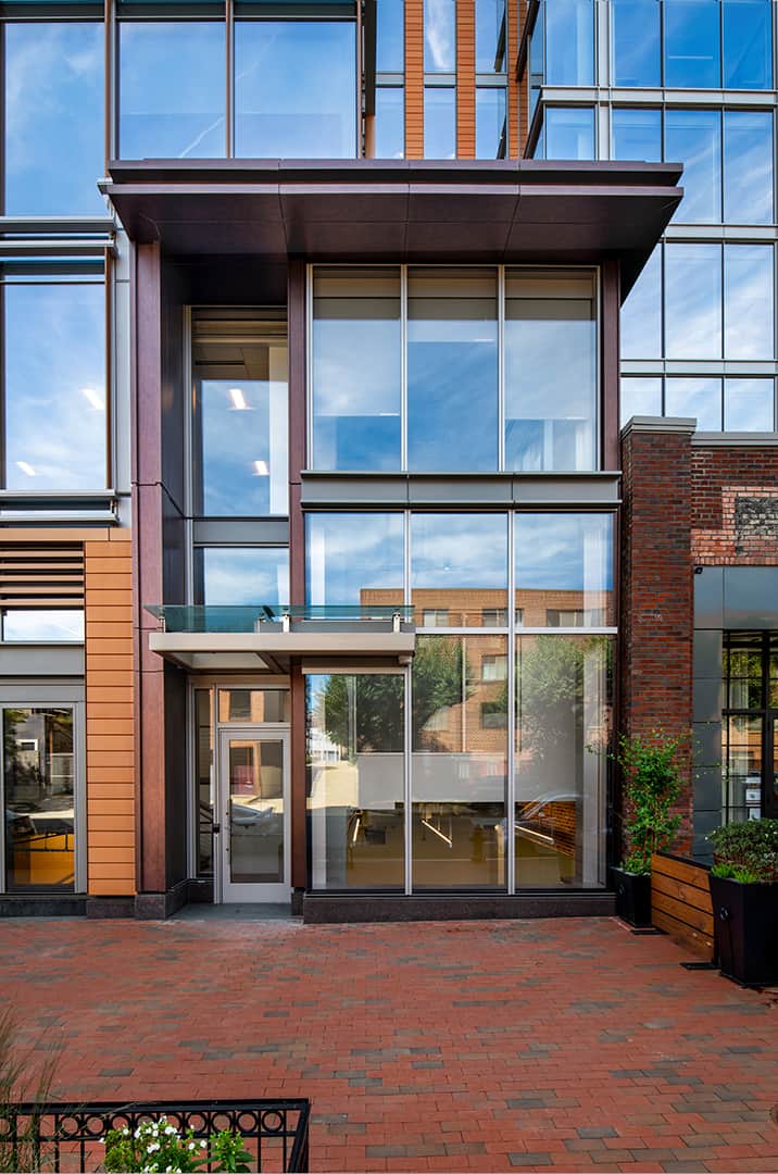
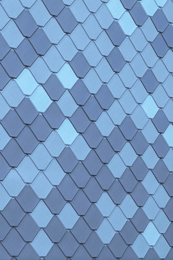
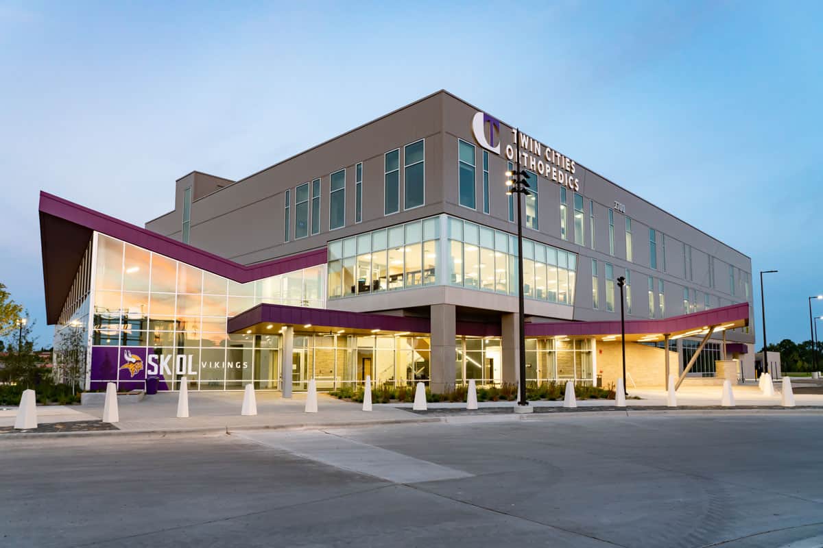

Above: 655 NY Ave using Castanye Blu for a street level entryway, PDZA with custom Marine Blues, TCO Performance Center using Vikings Helmet on the canopy, Amagansett Blue, Emerald Copper


